Task1c
- You are to choose at least 3 different media sectors and compare and analyse the use of different digital media graphics within those media sectors. You are to choose from the following:
- Moving image: motion graphics, e.g. title sequences for films, television and digital gaming
- Digital publishing graphics, e.g. e-magazines, DVD or CD covers, promotional materials
- Website design graphics, e.g. educational, corporate, entertainment
- Digital gaming graphics, e.g. PC, handheld, consoles or mobile gaming.
Moving image: (typography, birds eye view, colour - vibrant, circus, bright, candy. motion graphic, point of focus)


For this media sector of moving image, I have chosen a popular TV Soap opera called 'Hollyoaks' as shown through the screenshots I have taken. These screenshots are shots from the very beginning and then end, to show how they used different graphics styles to produce their shows title; typography, colour, point of focus, composition and font.
-
In the opening seen you can see from the screenshot, the font style they use is very modern and can be related to modernism, from the style its created, which could connote that it's a very modern show or from the capitalised letters, it could connote that it's very bold and open; a serious and dramatic show. The point of focus of this is to show us the title and the colourful wheel as it's composition is directly in the middle, which makes it easier for our eyes to respond to as it direct and the type of shot being used in this screenshot is a birds eye view. In the birds eye view shot, the point of focus is focused on the middle and on the title because everything else around it blurred and you can see this through the screenshot; therefore, this proves how it's point of focus is aimed to be direct to the audiences eye and show them the shows title of "HOLLYOAKS".
-
The colour shown in this screenshot is; white, yellow and red. The title is white, which could have many various connotations; heaven, cleanness, safety etc. Where, the image of the wheel, is in stripy repetitive colours of yellow, red, yellow, red etc. These colours could make audiences think of other brands or things which have similar colours, for example a ferrous wheel or candy (a lollipop), it could also connote danger from the red or alert. Or, it could connote energy or happiness from the colour of yellow. When some people saw the image first, the brand of McDonalds came to mind and sweets too, from the similar colour scheme. Whereas, others thought of a ferrous wheel or a funfair etc. However, these colours are very bright and vibrant, which could create different denotation as it may make the viewers feel more happy and show them that this show is a fun (colourful) , lively and upbeat place to be and this could interest more viewers to become more engaged.
-
With the second screenshot, it shows how the graphic style is actually used in this opening title. The way they present the title of 'Hollyoaks' is by the use of moving image as it's motion graphics because as you can see the little part of the letter is out and is still forming (you can watch the video to be sure), it's all random and like just lines and it forms together to create the title of the show. This is shown in the beginning of the video and at the end; it basically a reminder of watch you're watching, also being a method to make the title stick in your head (remembering where it came up and how it did - through motion graphic; being easier to remember).
The genre is mainly drama & Soap opera but they use lifestyle aspects because the show is a
soap opera show about how people live their 'lifestyle' but it's main purpose is to entertain viewers because of the action which also occur and different dramatic scenarios. This isn't shown in the video but you can see that it revolves around lifestyle because you see everyone enjoying themselves and how 'normal' humans would spend time. With their kids you can see they're at the funfair riding the rides, couples out with each other, friends playing at the pool or playing games, a woman in a wedding dress but no man (this could possibly show the dramatic side through denotation and connotation of why she's alone, swinging on a swing, in her white wedding dress..), friends partying at like a nightclub or bar - singing, playing football and having a barbecue. There's also a small clip where you can see fire and the camera angle is like in the fire and through the fire you can see a girl with a very serious/angry face. This could also represent the fact of action or drama/soap opera and this scene could be where she maybe burned down a house to get some revenge.
---------
The second moving image is based off a music channel on YouTube, which make remixes of original songs and they upload their music with a simple video of their logo and the way the music is played, it's shown through motion graphic.
In the video embedded above you can see how they use key elements graphic design to create better moving image. They use typography (font, size, style), different colours, motion graphic, title sequence, point of focus and composition.
The typography used is shown in the thumbnail of the video; shown above, and the font used is custom drawn but it looks very similar to the font of 'Loungetown'. The font they use may connote that their music is funky or simple with a kick/flick. It's very modern text and looks cool from the way it's represented; bold and italic and the use of underlining the word is to denote it's seriousness and they wan't the title of their logo to stand out. The size of it would be medium but it's quite open and bold, this is most likely used so they can make sure everyone is able to see the text clearly, and so it fits their logo perfectly. The title name 'Trap Nation' followed by the style of font, may connote how their remixes of music are meant to form a nation as they create one original song into the sub-genre of trap music; with beats, dub step, funky sound effects; cool music.
The composition and point of focus is directly aimed at the logo of the channel because it's directly set in middle and the motion graphics used in the beginning shows all their channels - different type of music nations. The point of focus is the logo as it fits the direct middle area and it's a circle, so it covers more circumference of the screen and this stands out from the background because it differs in the colours from the background; the background being dark and the logo is a black circle, with a white ring and the text is bold and white.
-
The motion graphic also flies out in like different colours of waves, behind the logo circle and it's motion graphic are only presented through the beat of the music, as it's animated to the beat. The transition flies out onto the screen and this is known as motion graphics because it's just an image but its a moving image. And, for each of their channels they have a little image to represent the name as in this one 'trap', they use skyscraper building and an animated helicopter flying back and forth above the buildings, searching for something; this could connote that they're searching for destruction or evil/ someone powerful but, that's just how good the music remix is. When the beat slows down or calms down, lines of motion graphic fly out as if it's wind and they're trying to connote that their trying to cool down their hot beat drop.
-
The motion graphics are used a lot in this video because in the background there's like animation of snow falling and around the logo beat waves flow out at the drop of each of the remix beat - as said before. The snow or little effects always correlate with a cinematic background because these make the video stand out even more and make it look cool/beautiful. Even sometimes when it's a big beat drop, the little effects burst out into stripes and follow the rhythm of the beat too.
-
The colours used in the video is mainly; black, white, pink, blue, green & orange. The black, white, pink, blue & green are always used in each of the different stations of their channels and in each different remix because this the main colours of their logo and their icon.
The waves are white,pink,blue & green and each of these different colours may connote differently; the white may connote light or safety because white is generally a colour of positivty and this may connote that the music is clean. Pink may connote love or that their music is cute because the colour pink is a delicate colour and they may want to connote that their remixes are delicate. Blue may be a connotation for intelligence, wisdom because it's a calming colour and they may want their viewers to sit back, listen to their music and be calm. Their logo always consist of white and black; these may connote a lot of difference because white may connote heaven,cleanliness and good.
-
Whereas, black may connote evil, dirt and bad but, since they combine the two and it's use as their logo for their remix, it may connote that their music is so clean and clear, that it's dirty and bad but in a good way to describe their type of remixes. The background colours are dim and the orange may be used to connote energy and happiness and the reason they use bright colours in their title, with a dark background, is so they can make their title and logo stand out from everything else and be the point of focus. The logo is almost like it's a bass box or a speaker but it's just a image and this correlates the motion graphics and aspect of moving image.
The graphic genre and style used in this media sector of moving image is portrayed through the video and i believe the two used is music and modernism. This is because the genre is based around music, which is being the sub-genre of trap music/remix. But, the style is modernism because of the way they've created their logo; what font, shapes, style and the shape of it; the composition and camera angle of the screen - Medium close up. The type of music remixes they create as well follow the same aspects of modernism and the background they always used are mainly cinematic views. The colours used too, are related to modernism, especially since these colours are used a lot today and this type/style of music (remixes/trap) is listened by modern society of today.
-----------------------------------------------------------------------------
For my third moving image choice, is a video of the Doctor Who title sequences. In this title sequence they use different graphic elements; typography, motion graphic, colour, transitions, composition and point of focus.
In this video it shows the use of moving image through motion graphic of the title sequences, they use transitions and the motion graphic which fly the titles out, while in the background everything else is moving too and there's like cool effects and animation of kegs and optical illusions.
The title sequences fly out with each person who was involved in creating this episode in the beginning, after they show some motion graphics of brown kegs going around in circles and as it goes deeper down it changes too spirals of roman times and then, where the iconic Doctor Who blue police box flies out the middle and off into the side.
The typography used for the title sequence has a very clear and big bold font size, with capitalised letters for the producers name and it has colours which make it look like the font is like metal, so it contrasts with gradient of silver and white to form this and the fades out into the next person, same font. The use of boldness and capitalised letters, make the producers name stand out towards the audience, especially since it mixes with the graphic elements of motion graphic and composition and creates the point of focus for audience in the opening scenes. The motion for it flies out directly in the middle and the audiences point of focus, is directly aimed at this. But near to the end, there's a different transition for the actual episode title and it shortly pops out of no-where, with a flash with the composition of being directly in the middle and our point of focus changes on this because it has a different style motion graphic and transition but, they still keep the same style of font and colour.
-
The colours used in this video are mainly bland, dark colours such as in the font gray/silver and in the background like blue and black. This is because i believe it fits the genre of sci-fi because the video is based around time travel and this is shown from the different motion graphics used in the title sequence, in the background. You can see lots of kegs, which could connote seriousness, intelligence or mystery during the moving of the different amounts of kegs. The colour gray may connote neutralism or coolness but to mix it with white and black, they may connote mystery and adventure, heaven and something powerful or strange to come. These colours are probably used because they infer the best for the genre of sci-fi. The colour of blue is used in the background, to probably connote with the black for space and give a spacey atmosphere and it's also used for the tardis; which is a blue box, which flies through the sky and space, as it travels forward or back in time.
They use motion graphic successful in this title sequence and they open with the producers first because they know, people don't like seeing that during the opening of the actual show and don't want to have to read it while watching the show. So putting it first gives them something to view, and then putt the title at the end 'Doctor Who', reminds them of what they're watching too and makes it more interesting for them to want to watch, because of the different motion graphics in the background - example; the kegs and space etc.
Digital publishing graphics: Music album, E-magazine, movie poster
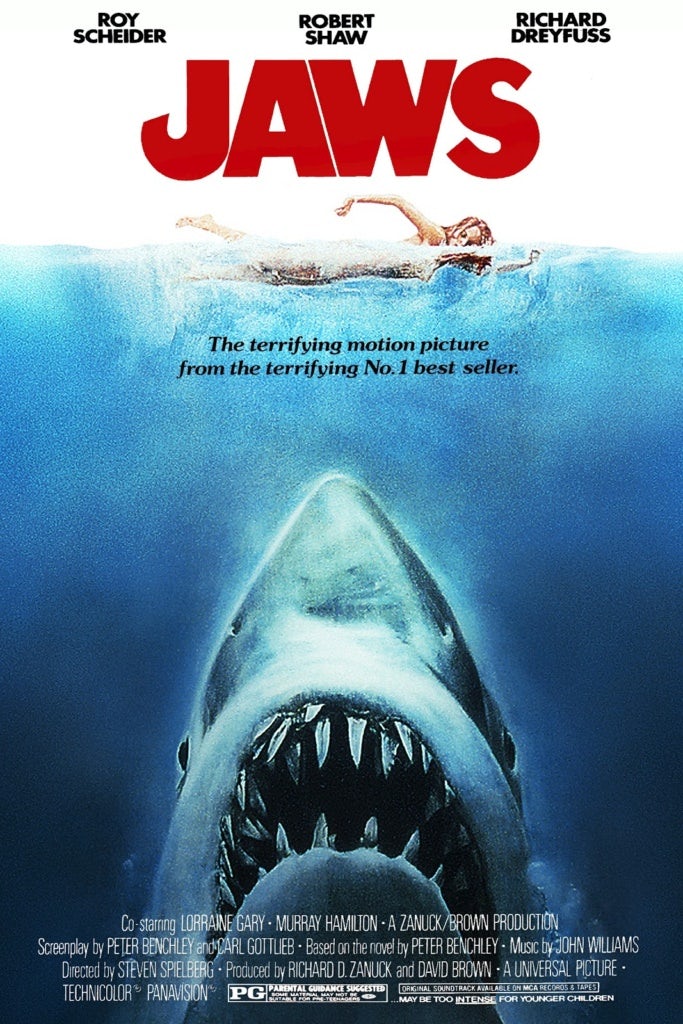
-

(typography, close-up , colour - vibrant, circus, bright, candy. motion graphic, point of focus, connotations/denotation)
In this e-magazine you can see various usage of different key graphic design elements, arranging from colour, composition, typography, point of focus and font. These are all used within this e-magazine shown in the screenshot above. These specific elements are used within this graphic design e-magazine portray how this e-magazine can become a successful publishing graphic and how it may appeal to more audiences (this depends on the age group too - fans).
-
The typography of the e-magazine on the left-hand side is like RNB/hip-hop style, where the font is bold and italic and the actual style of the font has like extra lining to each letter which hangs down, which makes it looks more cooler/artsy. This style of font correlates with the title because it fits the theme of hip-hop and the title is 'RapRader' which bases the magazine off rap music (hip-hop being apart of it too). The other text is just simple (in font) but its capitalised and bold because it's a quote about something motivational and since it's capitalised it could connote that it's trying to be serious as possible and it being bolder appeals more to audience, since it makes the text big and clear to read.
-
However, on the right hand side you can see that it has the information about the rap artist called 'Jay Z' but in the middle of the page from top to bottom, there's a big J in the colour of red but it's transparent so you can still read the text. The use of this big J could be to connote that Jay Z is a big rap artist and he wants his name to be known to everyone and this is shown by the massive J's composition; placed directly in the middle and it's directly in the audiences vision, especially since it's bright and aligned from top to bottom, so you won't be able to miss it at all!
-
The colours used in this e-magazine is mainly; white, red, blue & yellow. The red is very largely used in this because on the left side of Jay is red and it fades onto his face but it's transparent so you can still see his face but on the right side of Jay Z it's clear of colour but in the background of the right side, it's blue. This variation and gradient of colour usage could connote that the fact red is half on the side of the left side, it could mean it's half devilish or evil because left and the colour of red is generally connoted to devil or hell, evil and danger (a warning) but, since on the right side its clear of colour and the background is blue which could connote that since it's on the right side and uses the colour blue, it's heaven, trust, or wisdom. However, the red isn't directly halved, it goes over to the right side a bit which could show denotation that the evil within Jay Z is slowly taking over the good of his 'right' side. The colour black shown through his glasses and t-shirt may connote he has power over this magazine and wants audiences to see that he's in power; with either mystery or referring to death. The black shades he wears may be used as an art of fashion, to show he's cool.
-
The composition and point of focus is based directly at Jay Z's face, as it's placed in the middle and they've used a close-up shot to fill the whole page with his face. This allows audience to be directly focused on Jay Z's face; what he's wearing, his facial expressions, different contrast of colour and generally to see how serious or what position he's trying to express to audience, through this magazine cover - if it connotes with some other music or rap/hip-hop album covers, etc. This is proven because from the cover you can see his face fits the whole of the magazine (top to bottom) and the use of the extreme close up shot, is generally only used to show characters emotion/expression.
-
I believe the graphic genre and styles which can be assigned with this e-magazine are; grunge & music. I have chosen grunge because I believe that from the way the magazine cover is created and what props and colours used by the character within the cover, follow the same methods of grunge (in this style of fashion). Grunge colours is generally dark themed such as black and also may use colour red, mainly because these two colours connote danger, death, power, warning, mystery and evil. These two colours are used the most in the e-magazine which makes me believe it follows the style of grunge. Although, we know that the artist 'Jay Z' is a rapper and from the title 'RapRadar', proving it's rap rather than grunge, but as said before, it follows the fashion and style of grunge.
-
However, this point helps me lead onto my next; "music". I believe this e-magazine's genre is created based off and about music because of the title and what the e-magazine talks about. The title is 'RapRadar', which must be a type of magazine which likes to talk about to sub-genre of rap within the music industry. This is also portrayed through his style of fashion; simple black t-shirt, with some cool looking glasses and to top it off, a piece of jewellery. But, this doesn't clearly tell us it's about rap, other than the title of the magazine, you can see a headline of what the magazine will contain on the right hand side, at the very top; "The most exciting people in music - JAY Z", this therefore, tells us that the publishing e-magazine is about musicians and therefore, this fits my chosen genre.
Overall, this e-magazine is used in this media sector effectively because it digitally publishes news and fun facts/things people like about their favourite artists or type of music or how musicians do this or that, and what views other people have too.
-
The typography of the e-magazine on the left-hand side is like RNB/hip-hop style, where the font is bold and italic and the actual style of the font has like extra lining to each letter which hangs down, which makes it looks more cooler/artsy. This style of font correlates with the title because it fits the theme of hip-hop and the title is 'RapRader' which bases the magazine off rap music (hip-hop being apart of it too). The other text is just simple (in font) but its capitalised and bold because it's a quote about something motivational and since it's capitalised it could connote that it's trying to be serious as possible and it being bolder appeals more to audience, since it makes the text big and clear to read.
-
However, on the right hand side you can see that it has the information about the rap artist called 'Jay Z' but in the middle of the page from top to bottom, there's a big J in the colour of red but it's transparent so you can still read the text. The use of this big J could be to connote that Jay Z is a big rap artist and he wants his name to be known to everyone and this is shown by the massive J's composition; placed directly in the middle and it's directly in the audiences vision, especially since it's bright and aligned from top to bottom, so you won't be able to miss it at all!
-
The colours used in this e-magazine is mainly; white, red, blue & yellow. The red is very largely used in this because on the left side of Jay is red and it fades onto his face but it's transparent so you can still see his face but on the right side of Jay Z it's clear of colour but in the background of the right side, it's blue. This variation and gradient of colour usage could connote that the fact red is half on the side of the left side, it could mean it's half devilish or evil because left and the colour of red is generally connoted to devil or hell, evil and danger (a warning) but, since on the right side its clear of colour and the background is blue which could connote that since it's on the right side and uses the colour blue, it's heaven, trust, or wisdom. However, the red isn't directly halved, it goes over to the right side a bit which could show denotation that the evil within Jay Z is slowly taking over the good of his 'right' side. The colour black shown through his glasses and t-shirt may connote he has power over this magazine and wants audiences to see that he's in power; with either mystery or referring to death. The black shades he wears may be used as an art of fashion, to show he's cool.
-
The composition and point of focus is based directly at Jay Z's face, as it's placed in the middle and they've used a close-up shot to fill the whole page with his face. This allows audience to be directly focused on Jay Z's face; what he's wearing, his facial expressions, different contrast of colour and generally to see how serious or what position he's trying to express to audience, through this magazine cover - if it connotes with some other music or rap/hip-hop album covers, etc. This is proven because from the cover you can see his face fits the whole of the magazine (top to bottom) and the use of the extreme close up shot, is generally only used to show characters emotion/expression.
-
I believe the graphic genre and styles which can be assigned with this e-magazine are; grunge & music. I have chosen grunge because I believe that from the way the magazine cover is created and what props and colours used by the character within the cover, follow the same methods of grunge (in this style of fashion). Grunge colours is generally dark themed such as black and also may use colour red, mainly because these two colours connote danger, death, power, warning, mystery and evil. These two colours are used the most in the e-magazine which makes me believe it follows the style of grunge. Although, we know that the artist 'Jay Z' is a rapper and from the title 'RapRadar', proving it's rap rather than grunge, but as said before, it follows the fashion and style of grunge.
-
However, this point helps me lead onto my next; "music". I believe this e-magazine's genre is created based off and about music because of the title and what the e-magazine talks about. The title is 'RapRadar', which must be a type of magazine which likes to talk about to sub-genre of rap within the music industry. This is also portrayed through his style of fashion; simple black t-shirt, with some cool looking glasses and to top it off, a piece of jewellery. But, this doesn't clearly tell us it's about rap, other than the title of the magazine, you can see a headline of what the magazine will contain on the right hand side, at the very top; "The most exciting people in music - JAY Z", this therefore, tells us that the publishing e-magazine is about musicians and therefore, this fits my chosen genre.
Overall, this e-magazine is used in this media sector effectively because it digitally publishes news and fun facts/things people like about their favourite artists or type of music or how musicians do this or that, and what views other people have too.

colour, composition, typography, point of focus and font.
For my second digital publishing graphic, i have chosen a music album called 'Dangerous Woman' by Ariana Grande. From the image of the music album cover, you can see a different variety of graphic design elements being used.
Firstly, the typography; the title of the album 'Dangerous Woman' seems very simple as in font but the way it's written out is in full caps lock would could connote how serious they're trying to give the definition of title towards listeners. The word dangerous with the term woman written in full capital letters may be written this way because they don't want only her viewers to see how simple font and typography can have on her fans but, to also denote to anyone who reads the album, that women can be considered 'dangerous' too (as herself too, which is probably the main purpose shes trying to get through to audience) and for those who agree should purchase her album and listen.
-
However, with the font of her name on the album, it's size small but not impossible to read and it's in like cursive writing. The fact that her own name is smaller than the actual title portrays how she wants to get the album's title across more to their audience and since the composition of the title is placed at the very bottom, people will search for the title after actually analysing and having to go through the picture of her face. This will therefore, allow them to remember the title and image vividly.
-
The colours used in this cover is black & gray, this may be because it wants to show seriousness and follow up from the title being called 'Dangerous woman'. The black colour could connote to many different things such as; power, evil, mystery and even elegance. This is kinda shown in the cover because the use of colour show the elegance of how Ariana Grande is trying to portray herself, across all audience. The colour gray could connote that shes cool, moody or even to show how she can be good looking but still be dangerous and using the colour overall, connoting shes sophisticated clearly. However, the sense of not using colour and only using black and gray, could connote that she wants to show people no skin colour or colour could be like her and be 'dangerous' but, this could just be used to create an olden time theme.
The composition of her face is set more to the left side but her head tilts toward the right side, while her hair flows down to fill the rest of the bottom half of the cover, where her shoulder and chest fills the left side. and these are all in the picture frame. While her big black bunny ears come out of the picture frame, onto the top right hand corners and cuts off the image. This sort of composition may be used to fit the whole cover and make the point of focus directly on her face, especially since they use a close up shot of her. The camera angle shot used is a close up because they want to show her facial expression and how she's trying to represent herself during the outfit, to fit the style and aim of the album cover. It may be used to denote her as a cute, innocent, harmless girl trying to dress like a bunny but in reality from the colour scheme and title; she's really dangerous and violent.
-
However, the point of focus is is directed more to head and up to the bunny ears because the composition is set directly in the middle of the cover and this will be set directly to the audiences eyes and as once they see her head with the black mask, they'll follow their eyes to where the black mask ends; which is off and out the picture frame, this could show audiences how the album is trying to compare it self it photo realism because it's set to look like it's an olden photograph, with no colour and one of the old square frames but, in her image, her bunny ears come out of the frame so this shows that it's not real and portrays the aspects of 'photo realism'.
-
The graphic style used in this is music because the digital publishing is a musicians album cover for their new songs being released.
First media sector: Digital gaming graphics
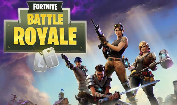
In this game cover you can see that it's been edited and created using graphic design skills. This poster is for a digital game called 'Fortnite' and the mode being for this game 'Battle Royale'; this is shown from the typography and title of the game. The type font they use is like bold and natural which could connote the seriousness of the game; since it's like a strategic and army visual game, shown form the two dog tags hanging beneath the text. However, the image in the dog tags is a gun and a pickaxe, this is referring to the style of what the game mode 'Battle Royale' is. This is where you use shooting and building and breaking objects to gain materials and cover yourself, while fighting in gunfight against other players online.
-
-
To compare graphic design styles with the sector of gaming is shown through it's colour, animation, lighting, angles and how they use posters and videos to advertise their game to the public. From the poster you can see that they use must have used Photoshop to edit and create each element of the poster; from the typography, to colour, to the composition of the game character. These specific elements allow you to realise the comparison graphic designs must have on the specifics of this media sector of gaming. They also must add a point of focus because they want to catch audiences eye on what they're trying to sell and from positioning the characters, font size and title, creates the main point of focus; as this it's drawn directly and straight to the audiences eye.
-
You can see in the background the lighting and how different gradient of colours are contrasting with the light; from the clouds you can see the light shines down, behind the character and doesn't overlap the game characters, it contrasts with the different gradient of colour at the bottom of the background and fades into it, as if there's no light actually coming from above. However, you can see the lighting on each characters face, as they want you to see how the 'game' characters emotions actually look like and represent the realism of an animation, with emotions and human characteristics. The lighting also shines onto the characters sword, which creates more visual for the audience, as it appeals since it's like a shine of light off a sword; this may interest some gamers because they consider the aspects of having swords, guns and weird (Thor like) hammers - medieval aspects.
-
The colours used in this game shown in the poster are purple, blue, brown, white, green & yellow, these colours can all have different type of connotations; green can connote freshness or ambition. The purple within the cloud could refer to that the atmosphere and the world the game is in some sort of nuclear situation or some apocalypse. The background colour of green on the title would be a connotation to army, as most armies wear green as their costume or armour. The font colour is yellow but you can see it has a gradient change or a shine of white, as if it's gold and it's shining but the yellow is normally compared to the sun, which could connote happiness and energy. Showing how much fun you can have while playing with the gameplay.
-
The animation within the game has to be controlled by the user using whichever device they're playing the game on; from xboxONE, ps4 and pc. These animations are comparison to motion graphics because in the video it's animated as if no one is playing; just like a movie and then it changes into the actual gameplay. The gameplay trailer at the very beginning opens with legal issues "Teen- Violence", this is to show audiences that the game is rated for this age group and that the gameplay trailer which is about to be shown, will have scenes of violence. This opening is almost as a warning.
-
The genre and style used within this game could be related to anime, cartoon & action because all of these aspects are used within the game and are actually used to create the game. Fornite is a game and is made using animation, each animation created through drawing and edited; so each gun, each colour, each character from head to toe and movement are all animated. The colour scheme is fit to fit the style of the game which is action because the main purpose of the game is to entertain and this is through the action of fighting other (real) players within the game and this is done through the aspect of shooting each other and needing to search for better weapons, break trees and rocks and cars to gain materials to build and cover yourself, during gun fight. This game is related to the genre of cartoon and anime because the characters are not real, they're cartoony and can be classed as anime because it's animated. However, it's more classed as cartoon because anime is based from the Japanese culture which have different aspects with drawing but I've included anime because it's a short term for 'animation'. It's also cartoon because from the opening scene you can see a flying bus held up by a hot air balloon, which is not really realistic and is more of a cartoony aspect.
--
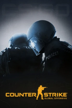
This digital game is called 'CSGO' short for Counter-Strike: Global Offensive. This game follows the graphic design elements because it crosses between different styles and genres and uses the elements to construct the actual game itself and advertise it through creating a cover.
In the picture you can see they use elements of graphic design from; typography - font size/type, they use colour, composition, angled shots, and how they try to complete their point of focus.
The picture uses composition of the animated character which are wearing army/solider clothing and are holding items such as weapons. The composition is placed from left to right but fits the middle half and the weapons cross into the right half. This may because they want to show each angle of the characters and how they look, what they wear and the details of their drawing and animation. These are placed in this position because it creates point of focus for the audience as it's placed directly in the audiences view and forces them to look at it as it fills majority of the page and allows audience to see what the game characters are like and what the game actually is like; guns and army style.
The typography and font used in this is very bold and simple, because they wish to show it's a serious game but from the little outline of a solider holding a gun, is placed between the first two words; which also portray how the game is about gun fights etc. The font size of 'Counter Strike' is medium and the 'Global Offence' is smaller because this is to show that it's a headline and this therefore means that this isn't the first and original counter strike, this is another mode and different type within counter strike.
-
The composition of the title is placed on the left hand side and a bit lower than the centre because it allows audience to analyse and see the whole of cover and then to see the text and remember what the cover looks like. However, in the background there's two big letters, " GO", this represents the version of counter strike this is and it's an acronym for Global Offensive. The use of making it large and in the right hand background, make it stand out from the characters and therefore, create vivid imagery for audience to remember which could eventually help them make their audience advertise their products to others and bring in a bigger market income.
-
The colours used in this cover is very simple but could connote otherwise. The colours are white, black, and orange. The black colour is used for the costume of characters because this style of costume and colour is used to represent the good side of police and serious police which deal with big problems such as SWAT team; where they wear black masks, body armour and helmets. The black could connote their power and seriousness, it could also be a connotation to represent that their mysterious or a representation of death&evil. The white is used in the text and this may be used to make the title stand out to viewers and create a clearer title making the point of focus onto the text, especially since it stands out the most with the dark colours of the background; gold and black. The background is like orange-gold and this may connote compassion, wisdom, happiness or even creativity.
-
This media sector uses graphic styles and genre because in the video you can see that they use animation to create the actual game and therefore, this follows the style of anime but it also follows like photo realism, action & adventure. This is because in the video it shows animation of the two different teams; the terrorists and the police. And, in the video the animation looks realistic because it follows how swat team would look like and it portrays gun fight and armies very clearly. In the opening scene it shows a helicopter flying and it looks so realistic because you can hear the sound too and the animation is perfect but you can tell it's animated.
And, in the start of the video, it showed an image of legal issues of 17+, rated M and what the video and game consists of. This is used so they cannot get fined because they give a warning for the specific audience this is aimed at and therefore, anyone under this age who is not allowed or just can't handle it, it's their own fault as they 'warned' them.
However, it follows action and adventure because its two teams, bad and good and the police have to fight the bad and stop the bad from exploding the nuclear place and in the video, you can see the gray nuclear towers. During the video it shows the bomb being placed down, the two teams shooting and each person dying (with actual similar sound effects) grenades exploding, blood, the team mates talking and in the end the defusing of the bomb and having to cut the right wire for it not to explode. BUT, just before the timer runs to the last second, as he's about to cut the wire and the timer ticks faster it cuts off into a cliff hanger, to represent the motion graphics of the game title. Therefore, making it a digital game as it's created by animation and the game is only access on digital devices such as computers, xbox, and ps4.
---

My third choice for digital gaming is the cover of popular game called GTA V (5) and i will be talking about the graphic design elements used in the front cover of the game for the PS4.
-
The typography used is simple squared font but there's no spaces at all, between each letter and each letter touches each other and are the same size. This is probably to keep it in a small area and with the black outline, to make it stand out to audience. The only font which is out of size and composition, is the version sign; "V", which is a big green V, which is Latin for the number 5. The other typography, is just the name of the console which this game is playable/for, which is shown at the very top, "PS4". The choice of style may be used to show seriousness and the V with the strap around it saying "Five", is just to show it's version 5 and make it look like it's an award because it's their 5th one.
-
The colours used are blue, white and black. The colour white is used in the font because this colour stands out the most with dark/dim coloured backgrounds, creating that main point of focus to audiences; being the fact that they are all directly aimed to see the name of the game and the version, especially since the composition of the title is set directly in the middle of the cover. The colour white could suggest purity, heaven or show something is brand new clean. The black could suggest it's evil and the use of outlining the white, could connote that the brand new clean thing, has an evil, destructive domains. The blue is mainly used at the top because this is the iconic colour for the box covers for the device of PS4; it's the white text of ps4 in white, with a blue background. I believe the composition of this is placed at the the top because our eyes are normally drawn to the top first and then down. The blue may connote heaven, intelligence or wisdom.
-
The background of the cover is like a collage of what looks like it to be things and characters which are in the game and how they actually look, is posted on the cover; so if the viewer likes it, they'll buy it. They also consider the legal issues by putting the symbol of M for mature age ranged audience from 17+, this probably because it contains guns, violence and women. And, this is connoted from the various images used in the collage for the background of the gaming cover.
--
The genre and style for this game is probably action, adventure and urban/lifestyle, because the game is about completing missions with different characters and you normally have to shoot each other because you're doing certain missions related to drugs or heists etc and you fight against gangs. The aspects of urban, adventure & lifestyle is because you have to earn money, and you can buy different apartments, houses, different cars ranging from normal cars to super cars or you can steal parked cars but you will get chased by police and if you do get chased by police and they catch you, they kill you and you have to restart over but you still keep your money and whatever is actually yours. You can dress your character by going to the store and purchasing different outfits and etc. You can fly helicopters, ride motorbikes, drive super cars and you can play with all these different things, with your friends online; which have the same gaming device as you (ps4+ps4) but, you can also play with other people, over the internet too. These also follow the aspect of animation because the game is a digital game which is created through animation and edited through computers and then played on different digital devices arranging from consoles such as; ps4 + xbox1, too computers such as; windows + mac.


Well done! Very detailed with thorough use of key terminology and a clear comparison analysing graphic design technical elements.
ReplyDelete2A. D2 (Distinction) you have analysed and compared technical elements of graphic design principles in three existing digital media products from three different media sectors.