Posts

Showing posts from February, 2018

Magazine questionaire

Which magazine idea would you prefer?   Why? What colour scheme would work best; blue & white, red & black, blue & green, yellow & green or black & white? What magazine would you most likely purchase? Why? What game would you like to see in the magazine? What musician artist/album would you like to see in the magazine? Which idea would create a better magazine?   Why? What would make my magazine unique? Is the purpose for my magazine relevant to my content? Do my mood boards reflect my magazine clearly? If no, why? Rate each magazine from 1 to 10 and give a short explanation for what is good and what I could improve.                             Thank you for taking your time to complete my questionnaire.                                                   Your feedback will be very useful. J

Task 2A - POSTER, WEBSITE & MOVING IMAGE

Image
This is a real campaign poster for a charity called 'Islamic Relief', where they raise awareness for Islamic countries which are in poverty, and struggling to survive by not having the simple essentials of food, water, shelter or even clothes. This specific poster is about misreporting Muslims and how the media portray Muslims as today and create this vicious Islamophobia amongst the public viewers, which cause the people in these bad conditions to be forgotten about and less people care about to donate too. -- The typography used in this campaign poster has two different style of fonts . The font used to address the  problem is shown as the title; "Misreporting - ", this is just simple, capitalised and bold font . This may be used to connote how serious the poster is trying to be and this use of typography , stands out most clearly to audience as it works well with the background. The second half of the title "- Muslims", is written in a differe

SWOT ANALYSIS

Image
Strength Weakness Opportunities Threats -- -- Strength and Opportunities, these are the two key terms made to ask what helpful objectives you've achieved. Whereas, weakness and threats are the terms to ask what objectives you achieved and if their harmful - The good side you've done and the bad side, example; What Went Well and Even Better If. The acronym SWOT, is generally used so you can structure your planning method and how you use the four elements (S,W,O,T) for a project - school work, a business venture or an organisation. -- -- 1st SWOT - Gaming The strengths for my gaming magazine is that it's very unique because this magazine is about a new released game which has been vastly shared across media and even celebrities play and know about the game. It's very unique as a magazine because since it's a new game, there's no magazine about Fornite and I'm trying and aiming to be one of the first to create this magazine. My

Task1c

Image
You are to choose at least 3 different media sectors and compare and analyse the use of different digital media graphics within those media sectors. You are to choose from the following: Moving image : motion graphics, e.g. title sequences for films, television and digital gaming Digital publishing graphics , e.g. e-magazines, DVD or CD covers, promotional materials Website design graphics, e.g. educational, corporate, entertainment Digital gaming graphics, e.g. PC, handheld, consoles or mobile gaming. Moving image: (typography, birds eye view, colour - vibrant, circus, bright, candy.  motion graphic, point of focus) For this media sector of moving image, I have chosen a popular TV Soap opera called 'Hollyoaks' as shown through the screenshots I have taken. These screenshots are shots from the very beginning and then end, to show how they used different graphics styles to produce their shows title; typography, colour, p

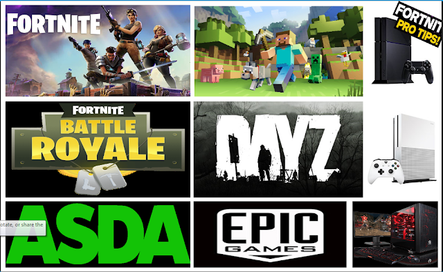
3 Moodboard

Image
- I have chosen these pictures for my mood board because my idea is revolved around the gaming aspect and the main game being 'FORTNITE'. This is because I enjoy this game and reasons I have chosen these images on screen is because these are all parts of the magazine I will be making. The first image, is to show what FORNITE looks like and how the characters and style of animation looks like. We can also see the style of font they use and this would be the type of font I will be using for the title of my magazine. The second image was chosen because Minecraft is a key aspect of FORNITE and I will mention some Minecraft key things because the game; FORNITE, was inspired by Minecraft, hence the building aspects. And, the fifth image being the second reason for their inspiration is Left 4 dead; this is because it follows the aspects of shooting and zombies (zombies in the first game mode). The 4th image, Battle Royale, is the new game mode which everyone enjoys because, you can p